Future Health Research
Improving health and wealth through future-focused research
The challenge
Future Health Research (FHR) operates at the cutting edge of health policy research, generating new insights and solutions to shape the healthcare policy debate in the UK and beyond. These insights inform the decisions of governments and health systems, enabling healthier people, communities and nations.
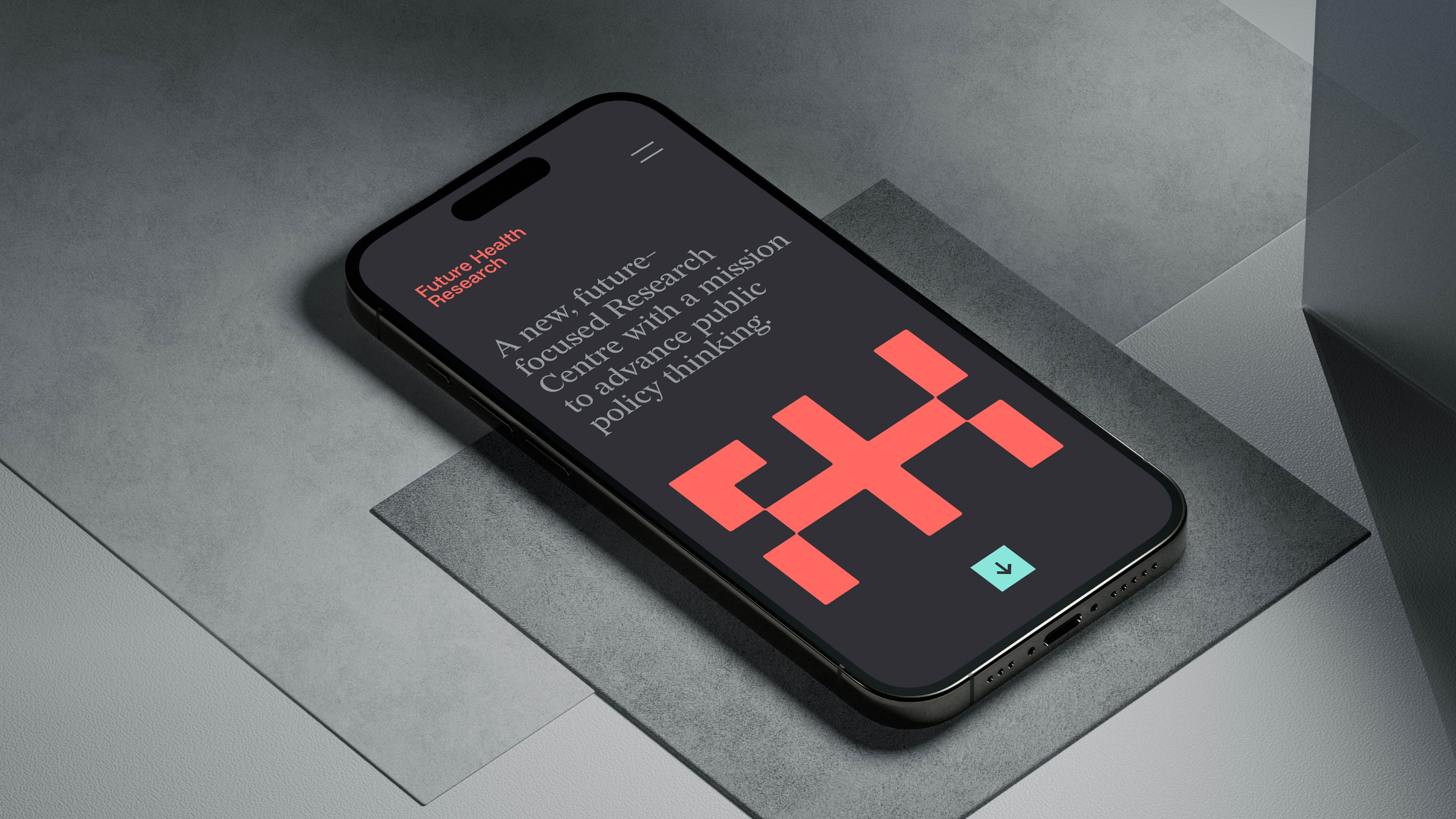
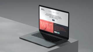
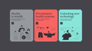
The unit was launched in 2021, led by Richard Sloggett, a former Special Adviser at the Department of Health and Social Care. In 2025, the team decided there was a need to overhaul their website to more accurately present their research programmes which sit across three key research areas:
- Building a Preventative Healthcare System
- Unlocking New Technologies to Improve Healthcare Outcomes
- Using Improved Population Health to Deliver Better Health Outcomes.
Richard and the team recognised that this was a key inflection point in their growth journey. They needed a fresh identity system that would help strengthen salience and build brand recognition across key research areas, providing a scalable platform that matched their growth ambition.

The solution
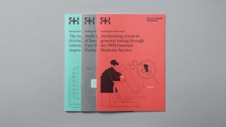
For sector stand-out we set out to challenge the identity norms of the policy/research space — typically academic, uninspiring and lacking finesse. We knew that flexibility was essential too, as the design system also needed to support a wide variety of niche subject areas.
We followed our tested 5-stage process with insight underpinning all decisions. A co-created set of key attributes became our checklist for the values that identity should embody: smart, intellectual, simple, accessible and dynamic.
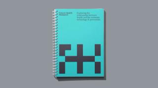
That identity began with the symbol; FHR's purpose is to contribute to the preventative health conversation and improve outcomes for society: an inherently positive mission, so we played on the plus/cross symbol — a universal healthcare icon that encapsulates FHR’s additive approach.
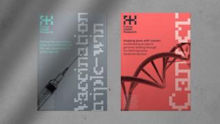
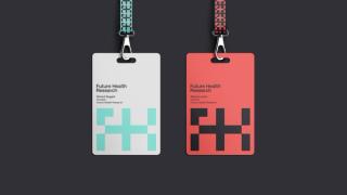
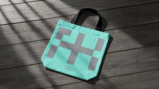
From there, we built out the entire identity. The cross was expanded into the FH monogram and that into the logo, alongside a pixel-based wordmark, custom typography and illustrations.



Colour is a powerful tool, and we chose to deliberately shun healthcare conventions of ‘clinical’ blues and greens, to deliver a more arresting and dynamic palette that would become distinctive, and reflective of the centre's influential voice. Cool, considered neutrals temper the vibrancy of the core palette, lending the brand an intellectual, high-quality flavour.
The result
The new identity and design system position FHR as smart, intellectual and experienced, yet also as the ones who deliver ideas that boldly challenge the status quo — exactly what’s needed to move society towards better health outcomes for all.
The team quickly grasped both our research and the sector we operate in, which made the whole process refreshingly easy. They've given us an identity that genuinely stands apart in a space that too often looks the same — and a platform we can grow into as our work develops. We couldn't be happier with the result.
Rebecca Lynch, Director, FHR